If 2024 was the year crypto reentered the mainstream through TV tickers and glossy ETF commercials, then 2025 was the year the market learned to live with that attention.

It absorbed it, metabolized it, and let it shape how liquidity moved day to day.
Some stories were loud and obvious. Spot Bitcoin ETFs pulled in capital, and price charts arced and dipped with the cadence of macro prints.
The more useful stories were quieter and lived in the market plumbing: who actually bought, who was underwater, which networks absorbed activity at tolerable cost, and which signals separated excitable rallies from robust advances.
A thousand charts could narrate the year. Only a handful do the job cleanly.
The best visuals don’t just memorialize peaks and troughs. They connect flows to behavior and behavior to price, and they still hold up months later.
That’s the spirit of this year-in-review: eight charts that earned their keep in 2025.
They start with the new center of gravity: ETF creations and redemptions, because the secondary market now often tells you more than the primary one.
They move through on-chain cohort lenses that have matured from niche curiosities into practical dashboards for gauging stress and relief.
They check valuation through the boring-but-true lens of cost-basis math that outlasts hype cycles.
Crucially, they look beyond Bitcoin.
They ask whether activity and fees are accruing where builders said they would, and whether payment rails outside DeFi kept scaling quietly.
Read them in order and you get a clean narrative arc. Drop in anywhere, and you still leave with a usable mental model for the year that was and the one we’re walking into.
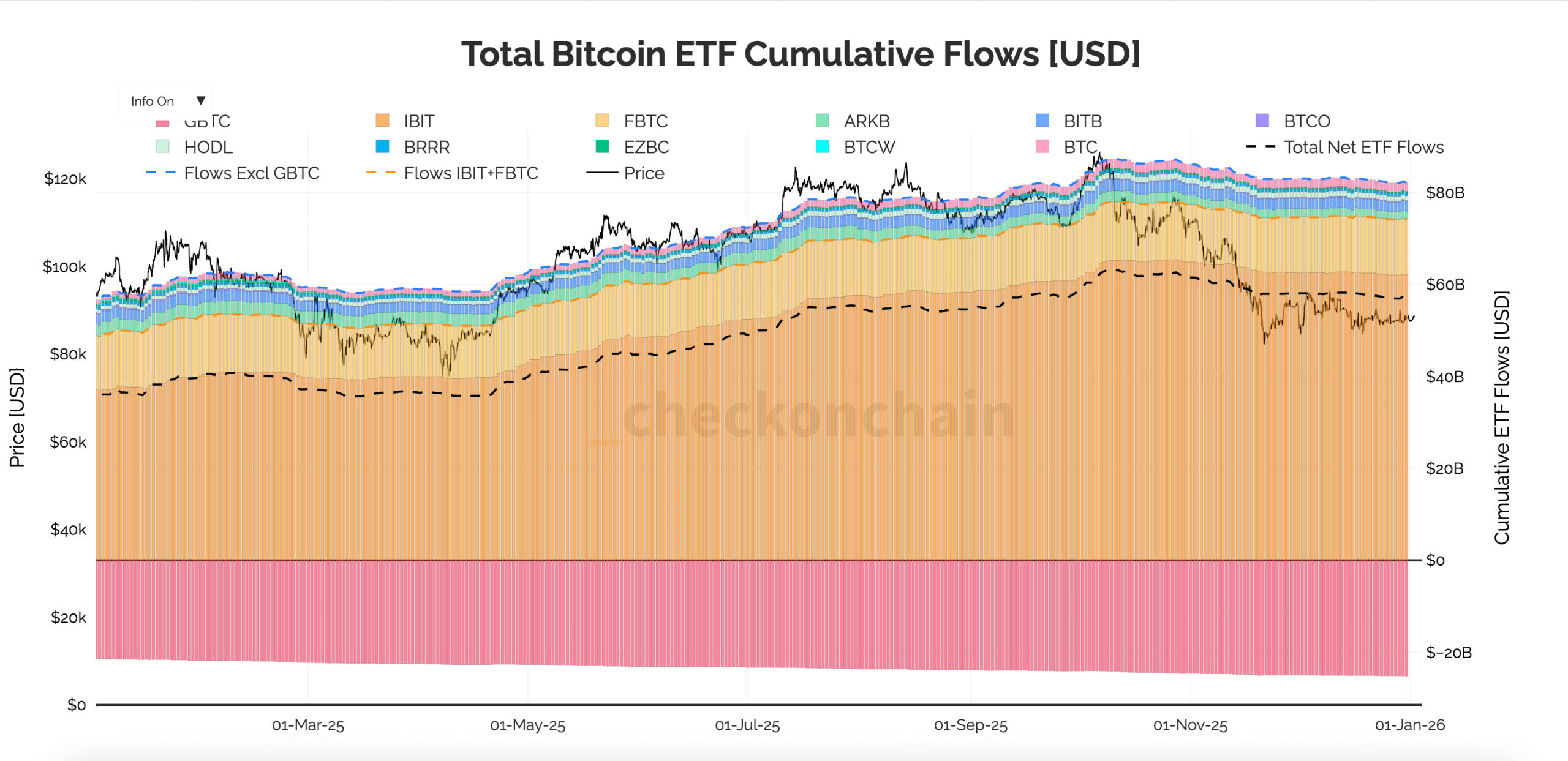
1) ETF daily net inflows
What it is: A daily bar chart of primary market creations and redemptions for the spot Bitcoin ETFs.
What it represents: Real, cash-in-the-door demand for coin exposure that removes (or returns) Bitcoin from circulating float as authorized participants create or redeem ETF shares.
The issuer split shows where liquidity and investor preference concentrate.
Why it mattered in 2025: This was the year the market accepted that ETFs aren’t decoration but destiny.
Strings of green bars often preceded grind-higher weeks and absorbed dips that would have snowballed in prior cycles.
Clusters of red frequently telegraphed air-pocket days, and the issuer mix showed which vehicles became genuine liquidity hubs rather than marketing wins.
2) Supply held in profit/loss by cohort (LTH vs STH)
What it is: A mirrored stack that places coins held at a profit above the axis and coins at a loss below it.
It’s segmented into long-term holders and short-term holders so you can see, at a glance, which hands feel flush and which are nursing paper cuts.
What it represents: The market’s emotional posture made quantitative.
Long-term holders mostly ignore noise, while short-term holders supply liquidity at turning points.
The balance shifts as rallies draw in fresh buyers and drawdowns force weaker hands to capitulate.
Why it mattered in 2025: This was a distribution year as much as an accumulation year.
The chart showed when short-term profit swelled into a twitchy overhang and when long-term loss quietly expanded.
That classic setup often preceded a sturdier base, helping separate exuberant tops from constructive resets.
3) Short-term holder cost basis
What it is: The average on-chain cost basis of coins currently held by short-term holders, compared with Bitcoin’s spot price.
It highlights periods when price slipped below that cohort’s breakeven.
What it represents: The market’s stress line for the marginal seller.
Above it, quick profit-taking tends to be absorbed. Below it, rallies can meet a wall of supply as underwater coins are sold into strength.
Why it mattered in 2025: The year saw multiple episodes where price fell below short-term cost, then reclaimed it with help from steady ETF creations.
Those fast “stress breaches” were buying opportunities more often than not.
What once looked like the start of bear phases became routine, almost mechanical resets.
4) Realized price
What it is: Bitcoin’s global cost basis, where each coin’s last on-chain move is priced at that day’s value and averaged across the supply.
It’s plotted as a single, slowly moving line beneath the faster-moving spot price.
What it represents: A grounded notion of “fair cost” drawn from on-chain settlement rather than order-book prints.
The baseline rises when investors pay higher entry prices and stalls when conviction fades.
Why it mattered in 2025: Realized price rose for long stretches, suggesting realized profits were being recycled into higher bases rather than fully cashed out.
The gap between spot and realized price was often a better compass than social sentiment.
Wide gaps tended to accompany speculative overshoots, while narrower gaps aligned with quieter consolidations.
5) MVRV Ratio (Market Value / Realized Value)
What it is: A ratio that divides Bitcoin’s market cap by its realized cap.
It’s often shown with cycle zones to frame when the market is historically cheap, fair, or running hot.
What it represents: Distance from aggregate cost.
The further MVRV climbs above 1, the more latent profit sits on the table, inviting supply on wobbly days.
Readings closer to 1 suggest less excess to shake loose.
Why it mattered in 2025: The year was defined less by euphoric blow-offs and more by long, loping advances punctuated by tidy drawdowns.
Drifts into the “warm” band, especially when ETF inflows cooled, flagged where mean-reversion risk outweighed breakout-chasing reward.
That helped readers avoid buying strength that didn’t need to be bought.
6) aSOPR (Adjusted Spent Output Profit Ratio)
What it is: A time series that compares the price at which coins move with the price at which they were acquired.
It’s smoothed over a week and anchored to 1 as the profit-and-loss fulcrum.
What it represents: Market behavior in real time: are participants locking in gains into strength, or capitulating into weakness?
It also hints at how efficiently the market digests that flow.
Why it mattered in 2025: Resilient uptrends showed a consistent tell: quick dips in aSOPR just below 1, followed by swift recoveries.
Those “reset and go” patterns, alongside green ETF prints and a reclaim of short-term cost, repeatedly proved more useful than overfit oscillators.
7) Ethereum fees
What it is: Total Ethereum fees across Layer 1 and the major Layer 2s.
What it represents: Whether Ethereum usage is scaling to cheaper layers without starving the fee engine that secures the network and pays validators.
It’s the economic reality beneath the architecture diagrams.
Why it mattered in 2025: This was the year the L2 economy felt less like a slide deck and more like a ledger.
A growing share of activity moved to L2s even as overall fees held up.
The pattern suggested users were finding acceptable price-performance and that builders’ promises were settling into routine rather than rhetoric.
8) XRP Ledger token transfers
What it is: A simple line chart of daily token transfers on XRPL.
No DeFi thrill rides, no narrative sugar, just throughput on a payments-oriented chain.
What it represents: The hum of real-world value moving across a low-cost network that, for the most part, sits outside the speculative loops that dominate headlines.
Why it mattered in 2025: As capital and attention swung between ecosystems, this chart offered a clean control sample.
It showed that payment flows can scale quietly in the background.
When transfers stepped up around pilot programs or corridor launches, it hinted at adoption that doesn’t need a bull market to be useful.
Tying the signals together
Taken together, these charts tell a simple story in a year that tried hard to be complicated.
When ETF creations marched higher, pullbacks served to reset aSOPR and move coins from short-term profit to steadier hands.
When inflows cooled and MVRV ran warm, the market asked for time, and usually got it.
Realized price climbed like a tide, lending buoyancy to dips that would have drowned prior cycles.
Meanwhile, Ethereum’s fees and XRP’s steady transfers were a reminder that networks don’t live by price alone, but by usage and by costs users can stomach.
If 2025 made anything clear, it’s that the right handful of charts beats the loudest thread.
The right charts don’t just show what happened. They explain why it lasted.
The post Bitcoin price charts lied to you last year, while these eight on-chain signals quietly predicted every single move in 2025 appeared first on CryptoSlate.